Tuesday, June 19, 2007

Summer Trading Ranges

The last two weeks have been unrecognizable as typical trading sessions. Volatility measured by the CBOE Volatility Index (VIX) has picked up as yields on the bonds have also picked up to levels not seen since last summer. That has led the market’s trading sessions to have ever wider trading ranges compared to the typical summer. Let’s take a look at some of the data and ask a few questions to why this might be occurring.

First, take a look at the chart below of the summer trading ranges on a daily basis. To keep things simple we have defined a summer session as June through August. As you can see by the chart below, the bull run of the late 1990s leading up to the dot com bust had high daily trading range averages. Through the first few weeks of June, we are approaching levels we have not seen since 2000. That said, also note that the first few weeks of trading this June have seen the index close near the highs or lows everyday. This could mean there is a great divide between the bulls and bears as both the bulls and bears have closed the index at its respective highs and lows during the session. Who will win the tug of war is still in question at these near record index levels.

Another interesting point to make is the summer trading ranges have typically followed the VIX (see chart below). If you take a closer look at these two charts together (which I would have overlaid, but I had a lot of trouble doing that), you will notice the spikes in VIX coordinate with the higher trading ranges, except for this summer. From 1998-2002, summer trading range averages were all above 17 points. Coincidentally, VIX held above 20 (except for a few dips below) from 1998-2002. VIX has spiked above 20 only once since then and has been hovering in the low teens for most of the past three years.

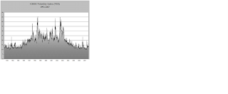
By analyzing the past 13 years of summer trading ranges and the corresponding VIX index, we see the correlation between the two is quite substantial. So why the dichotomy this summer? Well, it could be that we are in the beginning of the summer and the VIX hasn’t picked up the pace but could trend higher throughout the summer leaving the correlation intact. Or we could have an anomaly on our hands with lower VIX readings (below 20) and higher daily trading ranges (above 15). This could be a new trend where we begin to see this happen more and more often in the forthcoming years. Markets and traders can use historical figures as a standard, yet that is not to say the future will hold the same characteristics of the past or to put it in the all to often said phrase “past performance is not indicative of future results”.

The S&P 500 has looked a little “toppy” yet the bulls have not caved and continue to buy each dip as if it were the only opportunity to catch a ride. Most likely, if the higher trading ranges were to continue at these elevated levels VIX would pick up and the trading ranges will tend to be biased toward the downside (mostly because VIX and the market move inversely). These are some interesting markets and we will continue to spot these small nuances. Keep an eye on the summer movements as we could have a more productive summer in terms of trading opportunities than the past few years.

Inflation Tamed or Skewed?


“Household surveys conducted in April indicated that the median expectation for year-ahead inflation had moved up, consistent with the recent pickup in headline CPI inflation.”
FOMC Minutes – released May 30th, 2007


“Core inflation remains somewhat elevated. Although inflation pressures seem likely to moderate over time, the high level of resource utilization has the potential to sustain those pressures.”
FOMC Statement – released May 9th, 2007


These are the two main statements from the Federal Open Market Committee’s (FOMC) May minutes and statement highlighting inflation concerns. While reading these two statements, it seems as if the Federal Reserve continues its hawkish tone on inflation. However, just last week we received two more pieces of inflation data that will help fill in the puzzle for the FOMC at its next meeting on June 27-28. The numbers in May were more or less in line with estimates (see below) and the bulls embraced the numbers with more than a 1.5% gain throughout the week in all major U.S. indices. The headline number came in at +0.7%, slightly hotter than the expected 0.6% while the core CPI number came in at +0.1%, below the expected +0.2%. But does that mean inflation is tame, or is there a hidden story within the numbers?


If you have read some of my past posts, you understand that I am not a fan of the Bureau of Labor Statistics’ (BLS) methodology for calculating inflation. They completely overlook food and energy prices which can eventually affect monetary policy decisions. Before I jump completely off the topic and into the BLS’ methodology on owner equivalent rents (OER), let me discuss the omitted energy prices and their affect on the consumer’s pocketbook.


Financial media has been coat-tailing the fact that higher oil prices translate into higher gas prices and less disposable income being spent by consumers in other places such as retail. Although it could be argued that higher oil does not necessarily translate into higher gas prices, we will leave that up to energy traders. Consumer spending has continued to support the market to record levels because, well, consumers continue to spend in the face of higher gas prices. How you might ask?


First, let me remind the readers that as long as the consumer can withstand an increase in energy prices because of an increase in income, it should not hinder the consumer’s spending habits. In reality, the consumer has not felt the increase because they are taking home more income. According to Miller-Tabek research, personal income has been rising at an annual 6% rate or 0.7% more than the 15 year average. If we have above average income, there is a good chance the consumer will go ahead and spend instead of save, but can that 0.7% pay for an ever increasing energy bill? The answer is undoubtedly yes! Let’s see what Miller-Tabek has to say:


“The income numbers have simply overwhelmed, providing the best explanation for the resilience in consumer spending in the face of high energy costs. Incomes have increased $1.7 trillion over the past three years to $11.4 trillion, plenty to handle the extra $50 billion to $80 billion of added expense each year. Interesting also is the fact that the price of oil remains below its peak and hasn't really changed much since Katrina over 20 months ago. Since that time households have seen their incomes growth $1.3 trillion.”

So when discussing higher oil prices, let’s also mention income growth and whether or not the consumer will be able to withstand the increase with their income. The outlook for future income growth will most likely be less than the past three years, so keep an eye on income growth over the next few quarters. Currently, the consumer is still able to foot the bill and high oil prices should not be the media’s escape goat for the market not pressing higher.

Apparently, the markets now believe inflation is contained. Of course, as I mentioned above this ignores both food and energy prices. However, there are some other slick calculations made by the BLS to complain about. The biggest of those is about the BLS’ methodology in calculating OER which enables them to make higher inflation look like lower inflation. I have to give credit to http://www.bigpicture.typepad.com/ for discussing this in their blog.


First of all, why does OER even matter? Well, housing accounts for 42% of the CPI, which is then broken down even further where OER accounts for 23% (see table below). Therefore, OER should not be taken lightly. Here is a short description of the BLS’ methodology:


“The economic rent is the contract rent (including the value of certain rent reductions) adjusted by the value of any changes in the services the landlord provides. A change in what renters get for their rents is considered to be a quality change, which may be either positive or negative. The value of any changes is applied to the current economic rent to make it consistent with the previous data. For example, adjustments are made for most changes in utilities and facilities.”


Essentially, they net out utility payment so if the rent stays constant and utility payments go up; the OER actually drops. So not only does the core CPI remove food and energy prices from their calculation, but they alter the true price of OER due to netting out utility payments (which have been increasing over the past few years). Talk about creative accounting, this is creative deception. Economists are a slick group of people. Argue with a good economist and they could probably show you that we are in a recession at the same time the same economist argues for steady growth.

Sources: Bureau of Labor Statistics, Miller-Tabek research, Briefing.com, BigPicture.blogspot.com


Tuesday, June 12, 2007

World Asset Bubble: Jeremy Grantham Speaks

“From Indian antiquities to modern Chinese art; from land in Panama to Mayfair; from forestry, infrastructure, and the junkiest bonds to mundane blue chips; it’s bubble time!” By now you have probably heard this quote by Jeremy Grantham in his letter to investors (which includes vice president Dick Cheney and a host of other high profilers) discussing a six week trip around the world and the pending bubble popping events to come (at least by his predictions). Grantham is not the only forecaster that has mentioned the overvalued prices of assets across the globe. Most recently (May 23rd), in one of Alan Greenspan’s consulting appearances he mentioned that Chinese markets were at unsustainable levels.

Remember February 27th, 2007? The 4% drop in the US markets were widely considered to be to the detriment of Greenspan’s comments with regard to his comments that day of a 1/3 probability of the U.S. falling into a recession in 2007-08. Quite possibly he is early, but he obviously wants to go on record with his view just as he did when he was early in his “irrational exuberance” speech in 1996, yet he still has a point. Grantham makes just as good of a case in his letter, which we will take a closer look. Taking into consideration some of the thoughts from Jeremy Grantham, we can see that markets across the globe have been hitting record highs for some time now while others are just beginning to penetrate these new levels. Here’s a list of 10 markets that have posted new record highs in the last week or two (See Chart below). The percentage gains of each market are from the beginning of 2003 through this past week of trading. As you can see, the U.S. markets have been lagging all other indices respecitively.
(There are several other markets that are within a few percentage points of their all-time highs, but I decided to only list some of those that actually broke records).
So what exactly gives? Well, the markets have been driven by steady worldwide growth (see chart below) over the past several years and a liquid credit market making it easy to borrow money and put it to work. U.S. markets have been held up by earnings growth, which has slowed in this past quarter, and a record number of private equity deals or mergers and acquisitions.

See the chart below for an overview of the world’s GDP growth from 1980-2008 projections provided by the International Monetary Fund (IMF). As you can see, since 2003 we have been at a growth rate higher than any of the previous 27 years. That has helped propel worldwide equity markets to the record levels of today.

It is easy to get caught up in all the attention given to markets that are propelling to new highs. Really, who would want to miss out on a major bull market? The problem (as is usually the case) is the timing of the Grantham’s so called “worldwide bubble”. The markets are flatter than ever in terms of connectivity, communication and correlations mainly due to the internet’s rise in accessibility. Does that mean that if our market were to tank the emerging markets will follow? Not likely, as the U.S. markets have been one of the weakest performers over the past 12 months. With that said, we also have the most stable and predictable economy in the world.
Many analysts believe a shock to the Chinese markets may cause a windfall of turbulence for other world markets much like it did in late February.
With that said, the Shanghai index fell 6.5% on May 30th. Those same analysts would have expected a drop in the U.S. markets due to the shock. However, all major U.S. indices opened at the lows only to post record highs. Now, the activity we saw that day is now merely a blip on the screen. Although the world is more globalized and has a horizontal marketplace, one can not assume that market shocks will have worldwide impacts. May 30th is a great example of the isolation to a single financial market with no overflow effects.

If we are truly in an asset bubble at this time, there is always a catalyst to burst the bubble; what is it going to be this time? Jeremy Grantham says that “We (GMO, his investment firm) haven’t agreed yet on a catalyst for 1929, 1987, or 2000, or even the South Sea bubble for that matter.” He does however offer two main areas of concern; inflation and lower profit margins. Inflation may prompt the Federal Reserve to take monetary policy actions; whereas, the drop in profit margins over time could hinder financial market’s ability to maintain these high levels.
It will be interesting to see if either of these two factors come to fruition, but one thing is for sure…market’s around the globe have enjoyed a great amount of growth in the past five years.
Whether we come to a screeching halt or slowly contract these gains over time and the timing of either of these scenarios is the question that no one really knows. That is why the financial markets intrigue so many intelligent individuals. Until next time, enjoy the ride.

Commitment of Traders Analysis

Who’s on for the rally ride?

In today’s information driven society there never seems to be a dearth of data to rummage through and analyze. Because of regulations and the internet, much of the data is public and can be found by using some simple search methods. In the financial world, analysis is key in making decisions on certain stocks, sectors or industries. One report that has been readily available since 1962 is the Commitment of Traders (COT) report.

First published by the Commodity Futures Trading Commission (CFTC) in 1962, the report provides investors with up-to-date information on futures market positions and operations. Simply put, they were looking to provide better transparency in a market that was misunderstood at the time (some may argue that the futures market is still somewhat vague). The original report consisted of 13 agricultural products that traded in the futures market, but has since expanded to include most futures contracts.

The COT report tracks the trading activity each week of three distinct groups of traders; small traders, large speculators and commercial hedgers. Small traders are defined by trading fewer contracts than the CFTC requires you to report. The S&P 500 futures contract reporting level was changed from 300 contracts to 600 contracts in 1997 and remains at that level today. A large speculator is defined as trading a number of contracts in the required reporting level (greater than 600 contracts). The last group is the commercial hedger who is defined as a corporation which takes a position in a particular commodity for business reasons (i.e. hedging the price of corn for a corn farmer). The individual reports can sometimes be hard to understand, but there are services out there to simplify them for the individual or business. Schaeffer’s Investment Research has done a nice job in disseminating the information into a free and easy to understand charting tool that is free (http://www.schaeffersresearch.com/). After playing around with the COT charting tool, I noticed a few things that you might want to consider in your own analysis of the current market environment.

Let’s take a look at the five year chart below of the S&P 500 index and the related COT report of the small trader’s “net positions”. The red line is the price movement of the S&P 500 index while the blue line tracks the net positions of the COT report on a weekly basis. A negative net positions number indicates that the commodity is short during the selected time-frame while a positive net positions number indicates that the commodity is long.


Notice that while the S&P (red) has continued to move higher since bottoming out in 2003, the small traders have continued to lighten up on their long positions noted by the decrease in net positions. So if the small traders are continuing to lighten up on their long positions (especially right after Feb. 27th), how is the market continuing to pressure new highs each week?
That brings us to the next five year chart, seen below, which depicts the “net positions” of large speculators. Notice that, for the most part, large speculators had a negative net position for much of 2003 and 2004, but have since ramped up the buying efforts and helped propel this market where it is today; all-time highs. This five year chart also shows something that piques my interest. Notice anything?


This next chart overlays the COT report for large speculators and the S&P 500 over the past 12 months. Remember in the first chart what happened after the 4% drop on February 27th? That’s right; the small traders decreased their net positions. In complete contrast, the “smart money” or large speculators bought in on this dip most likely due to a perception that the move was overdone and it was a good buying opportunity. They were absolutely correct as the index has moved approximately 10% from the lows in February. Also make note that these same large speculators were decreasing their net positions leading up to the February 27th sell off. Another smart move.


Now take another look. It is fairly obvious that the increase in net positions didn’t last long and continues to decrease as many analysts, researchers and traders have noted the markets increasing potential for a major correction at what is being considered an above average length bull market and overbought conditionsAre the large speculators and the small traders finally on the same page? According to these COT charts, the answer is yes. But that does not necessarily translate into being correct as the market continues to move higher. They seem to not be participating in what would seem to be an obvious bullish market. I am not the only one out there looking for a pullback in the next few weeks, so take the COT reports (http://www.cftc.gov/) into consideration the next time you are looking for where other traders are putting their money.

Sources: CFTC, Schaeffers Investment Research

Doji Candlestick Company

If you haven’t noticed it, be cognizant that major financial markets around the world have been reaching record highs. I am sure you already knew that, but it’s great news for the everyday investor. Although this is all fine and dandy, be alert that some analysts and researchers have been talking about the “frothiness” of these markets and are noticing some signs of topping out in the U.S. One of the markets we follow closely is the S&P 500 and it turns out there was a major sign of a market topping chart pattern just a few days ago on Tuesday the 16th.

During our analysis of the daily charts, we noticed what is commonly known and referred to as a doji candlestick pattern. A doji looks like a cross, inverted cross or plus sign such as the one below. Technical analysts attempt to look for certain chart patterns over several time frames and theoretically predict future price movements off of chart patterns. A doji candlestick is one of those patterns.

Many technical analysts believe that the doji is the most important candlestick to recognize as it often marks the beginning of a minor, intermediate or major trend reversal on a daily chart. Failing to recognize these patterns could result in being on the wrong side of the market at the wrong time.

Please note that there are four types of dojis; common, long-legged, gravestone and dragonfly. All of them occur when prices opened and closed at the same level so that no real “body” is visible; however, the difference lies in the look of each doji candlestick. See the table below for a better look at the different doji patterns.Let’s take a closer look at the daily chart of the S&P 500 in which a doji candlestick appeared on Tuesday. In this chart of the S&P e-minis (ES M7) you should notice the four highlighted dojis. The first doji came as the market attempted to recoup losses from Feb. 27th; however, the market opened and closed at or around the same level so that no “body” was visible in the candlestick. This doji is referred to as a common doji. Since it was coming on the back of strong gains over the past week, it was a signal that the market needed a rest and subsequently the market began to tumble shortly thereafter.

The second doji came just after some consolidation after more March gains. This is considered to be a long-legged doji because of the size of the trading range, or size of its “legs”. Again there is no visible body on the candlestick showing the market opened and closed at the similar prices. This particular doji signaled the bullish trend that was present was likely to continue and in fact, the market continued to rally.The third doji appeared after several strong gains in the market. On this day, the market opened higher then began to consolidate by moving lower only to meet more buyers at the lows and recover all the losses to finish near the open, which was higher to begin with. This is considered a dragonfly doji and has bullish implications in a bullish market as the sellers could not hold their ground.The last doji and most important in my mind is another common doji and it has happened at a point of congestion for the markets. New highs continue to be pressured and have since created some resistance near 1515-1519. On Tuesday, the market made new contract highs in the June futures only to find more resistance and retreat back to finish near the open, creating a doji that some will refer to as a short-term to intermediate term end to the bull run. You should also notice the congestion that is beginning to happen near 1500-1520 showing some signs of fatigue in an impressive bull run.

Although I am aware of the potential consequences of the doji candlestick pattern, it will be hard to pressure this market lower if positive economic data continues to come into the Goldilocks’ household. A bearish doji does not imply an immediate move lower, but it signals a good probability of it doing so over the course of the next few sessions. We will continue to watch this play out as it is options expiration week and will tend to have a bullish bias anyway.

Market Momentum Indicating Overbought Levels

Four straight record closes for the SP 500 and six consecutive days of gains leaves us at a point in the market that things have started to diverge. As the SP posts new highs, the yield on the ten-year note has approached its yearly high and sits near 5% for the first time since last June. Interest rates are not a problem until they are. Has the market overlooked this fact?
Today, the market has seen some selling activity mainly because of three factors. First, there are no catalysts to push the market higher and second, the ten-year note approaching 5% has some investors acting a little finicky. Ben Bernanke spoke this morning from South Africa and effectively reiterated the FOMC minutes from last week. He sees economic growth picking up to more normal levels in the coming quarters and although inflation has moderated, the risks are still to the upside. And last, but not least, the market momentum indicators are showing some overbought conditions that need to be relieved.

In this chart of the SP e-mini futures contract I want to take a look at two momentum indicators; Stochastic Oscillator & the Relative Strength Indicator (RSI). First, notice that the market has made a considerably steep rally over the past several months to reach new all-time highs on May 30th. The green circles highlight the market’s buying pressure. The red lines point to “relief” points when the market dropped and relieved an overbought level only to continue moving higher and into overbought territory again.
Another highlighted region is the negative divergence of the RSI line and the market. Eventually, the RSI line will begin to level out when buyers and sellers meet the supply and demand for each other. With the current overbought conditions, there is a chance the market would begin to follow the RSI. Remember, this is not the first time we have seen a negative divergence as the market climbed higher. Just look at December 2006 through early February and you will see similar action.

It is not uncommon for a bull market to be in overbought territory for long periods of time; however, eventually the market needs to rest. One of the things to watch here is how the markets close each day. Yesterday, the market closed near its highs for the day (flat), but it is the buying pressure into the close that is keeping the markets near these overbought levels. Personally, I don’t believe the buying pressure at the end of the day will continue for much longer. We would like to keep an eye on any sharp moves downward that end on high selling pressure. This could lead to the 3-5% correction we are looking for over the next week or two and an interesting summer of trading. Enjoy!

Thursday, April 12, 2007

Mirror Mirror on the Wall - Does Margin Debt Predict Them All?

Recently, I was reading an article that was began discussing the record levels of margin debt on brokerage accounts. It made a deft point that record levels of margin debt “is a red flag that the market is over-inflated by speculation”. This is a bold statement; however, it is on the right path. Let’s take a deeper look into what they might have meant by that statement and what it may mean for today’s markets.

Since 1970, on a monthly basis the NYSE has been reporting the aggregate debits in securities margin accounts in which they kindly organized into tables and excel sheets. The chart below shows this data since 1996 plotted with the S&P 500 cash index.


As you can see in this chart, the margin debt (in $ mils) and the S&P 500 have a very closely related relationship. The record margin debt in February 2007 was $295,870; whereas the previous record was $278,530 in March of 2000. Is it a coincidence that the previous record was also at the peak of the dot-com bubble just before the markets began to crash? Maybe so, but I wouldn’t bet the farm on it.

The most logical reasoning/theory behind the close relationship (if you look at it, their activity almost mirrors each other) is that when the market is racing higher, market participants want in on the action and therefore leverage their brokerage accounts to take advantage of the rally. A high amount of margin debt also means there is a high level of bullishness. On the flipside, margin debts decrease as the market retreats due to a plethora of margin calls and participants having to get out of the way of an incoming steamroller.

Margin debt can be healthy during bull markets as it provides fuel for further market gains. The problem comes in when excessive speculation comes during a “false” bull market, which is where I believe we might be right now (the latest retest of the highs since Feb. 27th is a false rally in my opinion). The pitfall is when a steep decline in stock prices exposes investors to margin calls, requiring them to post additional collateral or sell securities resulting in even steeper declines such as February 27th, 2007. With so many questions in the marketplace; housing, inflation, interest rates, credit tightening, a weakening U.S. economy, trade deficits, budget deficits, weakening dollar, higher energy and commodity prices and equity markets at or near all-time highs, one has to wonder if a decrease in margin debt is necessary to bring the market to less prone levels.

At these levels, a doomsday may not necessarily be in the works, but it does make me wonder how long or how much higher both margin debt and equities can go. Since they mirror each other so closely, both of them are important to watch. At the same time there is a second voice in my head that tells me to be weary of false rallies in the market and to look for opportunities to hedge positions. As always, I hope you enjoyed the read and let’s see where the next few weeks take us. Tomorrow is the release of more inflation data (Produce Price Index) and it will be a market moving event. Which direction the market will go next is anyone’s guess. To paraphrase the JP Morgan, the only thing I know is that the market will oscillate with incoming data and news.

Sources: NYSE, eSignal